The “Before” Pictures

Grab a glass of wine, and use the restroom now, because this post is  A LONG ONE.

I have been meaning to post all of these pictures for quite some time, and now is as good a time as ever, right??

As you know, we just moved into our first home after the new year, and so before posting about any progress we’ve made, I want to document all the “before” pictures, so that you can see what we’re working with, and so that as we update each space, there is a good point of reference… so let’s get to it!!

THE EXTERIOR:

IS529u0pvsily80000000000

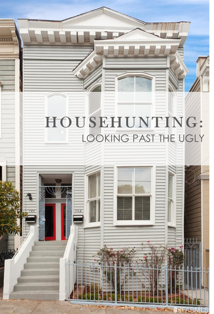
Above is the exterior of our new place, which we love.  Like LOVE.  I am still in awe that we are living in a historical old Victorian in San Francisco, and that this place will be so incredibly different from anywhere else we ever get to live.

All the detail of the Victorian facade is accentuated by the various colors used – there are probably 6-7 different paint colors on the exterior – white, cream, several shades of light yellow, periwinkle, dusty blue, and then the gold leaf. The gold makes all the pretty scrolled details pop, and its such a special touch.

439383_1_1

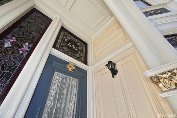
That’s the thing about these old San Francisco houses – you can get away with some really crazy color combinations and it’s charming (for the record, I do not consider our house’s exterior to be one of the “crazy” ones… but some of these houses are really elaborate, and use really unique color combinations).

The thing with our house is, while the outside is colorful and cheery, and inside is just as colorful… but in a very different way. The best word I can think of to describe it is “manic.”  The definition I found could not be more spot on: “showing wild and apparently deranged excitement and energy.”

Let me elaborate…

THE ENTRY:

When you walk in, the first thing you see is this…

IShn5vnem6yfx80000000000

There is A LOT going on…

There is wallpaper… lots of it… and lots of different kinds.  We’ve got the pale blue and gold trellis paper (which I happen to love), a faux finish wallpaper meant to resemble Italian plaster walls (you can see it a little better in the photo below), the art deco inspired teal and burgundy scallop trim, and lets not forget the starry night  wallpaper in the alcove.

To add to the crazy color scheme, all of these different wallpapers are accented with some really interesting paint colors… cranberry picture rail moulding, hunter green and gold corbels, a fleshy / nude paint on the casings around the doorways, and tan and mint green paneled waist-high wainscoting.

ISpt776lqe6dx80000000000

I get what they were going for here – it’s certainly funky and full of character, and while I have a real appreciation for the Victorian authenticity of some of the patterns of the wallpaper, it’s just not my jam.

The starry night looks like it could be cool in the pictures, but just trust me when I say, it’s a bit much in real life.

The blue is not a deep and subtle navy, but more of a cobalt… and right next to the hunter green and bright cranberry trim. I actually feel like all these colors and patterns take away from the beautiful moulding and paneled wainscoting.  My goal is to make the trim and all it’s details really stand out as opposed to having this space be so busy, and colorful, and well… manic.

THE PARLOR (CURRENTLY, OUR DINING ROOM):

Anyway, moving on… directly to the right of the entry, is a doorway into the “parlor” – yes we have a parlor!

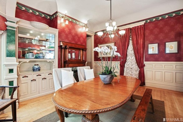
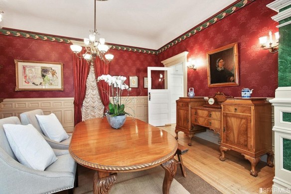
Right now it’s being used as a formal dining room – eventually it may become an office / guest-room / playroom, but before we moved in it looked like this:

ISp908q4yl24l50000000000

Pretty amazing right??

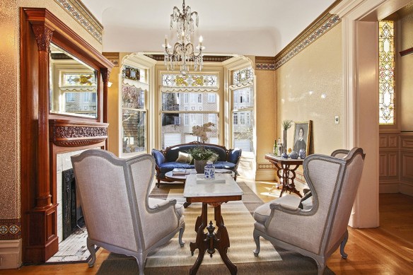
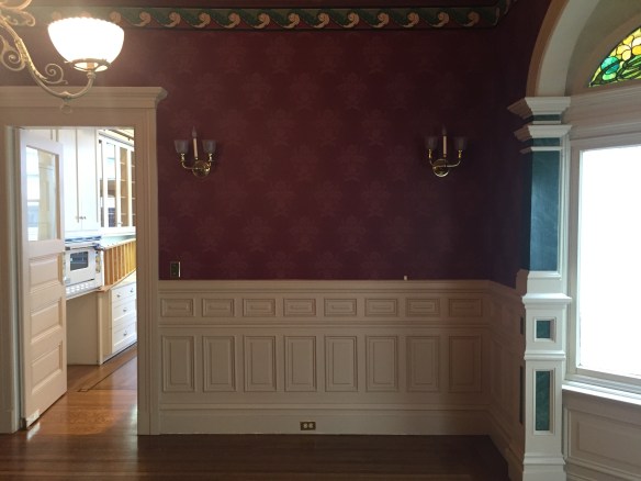
In real life, the wallpaper is very gold – I don’t love the pattern, and I don’t love the colors, but let’s talk about what I do love though.

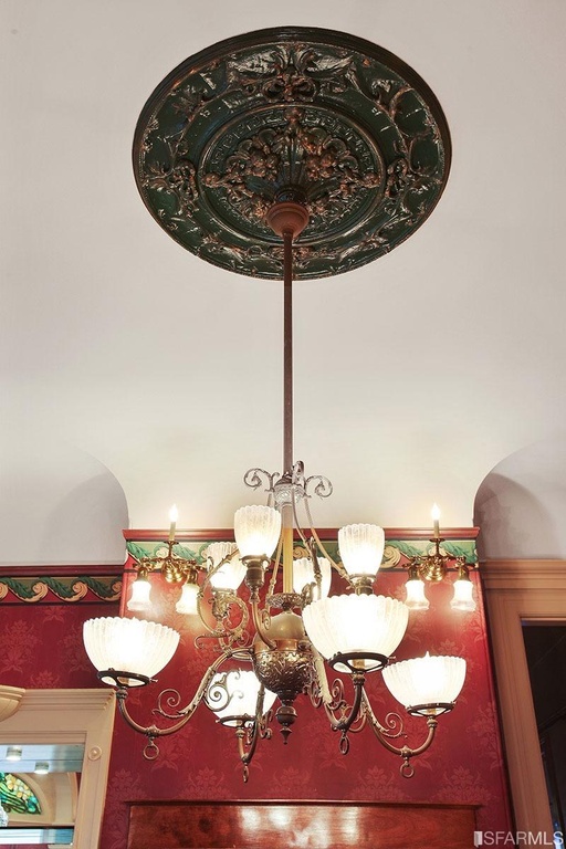
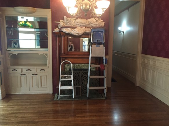
The crowning jewel of the room… the original chandelier.  It is so big and gorgeous in real life.  Also, look at the original fireplace ! The carved details are so pretty and unique.  The stained glass above the bay windows is my favorite in the whole house, and with the detailed plaster detail framing the windows… it makes my heart skip a beat.

In this below picture, you can really see the detail in the windows, and also you can see the stained glass in the entry hall (right hand side of the picture) which is so sooo pretty.

IS5m4wqh62jyk50000000000

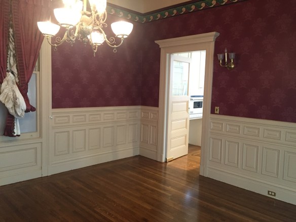
I don’t have current pictures of this room now that we’ve moved in, but trust me when I say that it looks like a HOT MESS.

Don’t be fooled by how pretty it looks in these photos from the listing… this is what it looks like today:

TBDTBDTBDTBDTBDTBDTBDTBDTDBTBTDBDTBDTBDTBDTDBTDBTDBDTBDTDBDTBDTBTBDTBDTBDTBDTBDTBDTBDTBDTDBTBTDBDTBDTBDTBDTDBTDBTDBDTBDTDBDTBDTBTBDTBDTBDTBDTBDTBDTBDTBDTDBTBTDBDTBDTBDTBDTDBTDBTDBDTBDTDBDTBDTBTBDTBDTBDTBDTBDTBDTBDTBDTDBTBTDBDTBDTBDTBDTDBTDBTDBDTBDTDBDTBDTBTBDTBDTBDTBDTBDTBDTBDTBDTDBTBTDBDTBDTBDTBDTDBTDBTDBDTBDTDBDTBDTBTBDTBDTBDTBDTBDTBDTBDTBDTDBTBTDBDTBDTBDTBDTDBTDBTDBDTBDTDBDTBDTBTBDTBDTBDTBDTBDTBDTBDTBDTDBTBTDBDTBDTBDTBDTDBTDBTDBDTBDTDBDTBDTBTBDTBDTBDTBDTBDTBDTBDTBDTDBTBTDBDTBDTBDTBDTDBTDBTDBDTBDTDBDTBDTBTBDTBDTBDTBDTBDTBDTBDTBDTDBTBTDBDTBDTBDTBDTDBTDBTDBDTBDTDBDTBDTBTBDTBDTBDTBDTBDTBDTBDTBDTDBTBTDBDTBDTBDTBDTDBTDBTDBDTBDTDBDTBDTB

We are using it as our dining room / storage room, and it’s full of boxes, and a too-big dining room table.  It went like this… the movers dropped our stuff off, and it stayed exactly how they left it ever since. Ha!  That said, I love dreaming about what it could look like eventually.

Building a window seat in the bay window is an ultimate goal – it’s a great spot for people watching in the park, and it gets such nice late afternoon sun – even in the winter.

I also envision built-ins flanking the fireplace, for additional storage… or maybe even building desks into the built-ins…

IMG_2899

What a showstopper – of all the lighting left in this place, this is perhaps the only fixture that we will ultimately keep. Once it’s cleaned, it will really sparkle!

Also, now that I’ve completely hated on the starry night wallpaper in the hallway, I have a little secret…

439383_4_1

The alcove above the bay windows has the same paper, but I happen to LOVE it up there.

It looks like a deep navy instead of how it reads as “cobalt blue” in the hallway. It’s still funky for sure, but I love how it’s like a little secret, the way it’s tucked up there.  I envision it being a favorite spot for little ones (eventually) to play and daydream.

THE GUEST BEDROOM / FUTURE BABY ROOM:

Right off this front parlor is the first bedroom – there are old pocket doors that close the two rooms off, which are so charming and pretty.  Right now, the room is dedicated to storage… it’s all boxes, but eventually it will be the guest room… or a nursery.

In the below picture, you are looking back at the front parlor, through the pocket doors.

ISpp0jjspy4e870000000000IShjy61mlqwg870000000000

And here they are closed off.IS9xjiklgxn7y80000000000

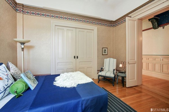
This picture below, shows the room from the other direction – standing in the pocket doors looking towards the back wall and window.ISh3mu2sk5w4y80000000000

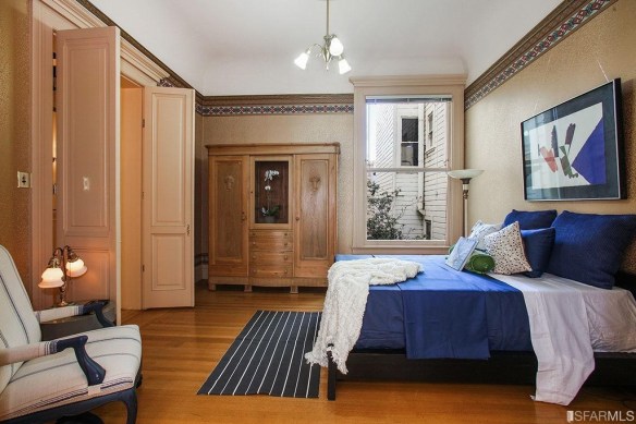
As of this week, here’s how the baby / guest room looks:

IMG_3954IMG_3953

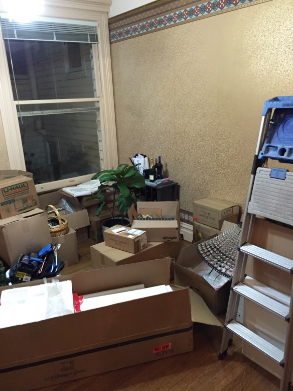
It’s a disaster.  And the mess gives me total anxiety.

Let’s pretend it doesn’t exist!

HALL BATHROOM:

Moving down the hall, there is a bathroom that is very cramped and VERY 90’s right now.

The photo below IS NOT AN ACCURATE DEPICTION of how this looks in real life.

At all.

439383_40_0.jpg

This photo really makes it look so much bigger, brighter, and nicer than it is.

In real life, it’s dark… like really dark… and you walk straight into the sink as you come through the doorway. And, I don’t believe that the shower was built to code.  It also seems odd to me that the ceiling is 15 feet high like the rest of the house, but the shower, tile, cabinets, and everything else stops at about 7 feet.  It just makes it all feel so closed in.

This is on the list for a renovation down the line, but for now, it functions, and it’s livable.

MASTER BEDROOM:

Next up is our bedroom..

The staging for this struck me as so odd (most of the staging was terrible, but this room really confused me).

It’s a massive bedroom (around 17’x17′) with an en suite bathroom, so it’s clearly the master, but it was staged as a kids bedroom with a double bed, plaid bedding, and a stuffed husky.  So bizarre.

439383_33_0

It looks SO DIFFERENT now (and so much better) with our furniture.

Ugly staging aside, we really like most things about this room – the medallion wallpaper is really pretty in real life, and the corner windows are SO BIG.  They’re nearly 10′ tall, but it’s hard to even tell in photographs how tall the ceilings and windows really are.  Trust me when I say, they’re massive.IStkfuj88h7dy80000000000

We just got a new chandelier that will replace the old light fixture, but other than that, the room hasn’t changed much since moving in, aside from moving our own furniture from our old bedroom in.

MASTER BATHROOM:

The bathroom attached to the master, is similar to the hall bathroom – a bit dated, and a bit cramped the way it was planned, but livable.

IS17ui09dagm870000000000ISd8b6jvz0riy80000000000

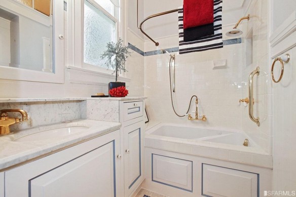
I secretly love using the Jacuzzi soaking tub, but it’s such a pain in the butt – it’s hard to climb in and out of it since it’s so tall, and it stops about a foot and a half from the wall, so it doesn’t make the most of the space.

The dual height counters also make it feel more cramped, there is nowhere for us to hang our towels, and like the other bathroom, all the cabinets, and tile end at around 7 feet, so with the high ceilings, it feels sort of dwarfed.

I’ve been doing a lot of brainstorming on how we could change this to make it more functional, and visually open up the space, but of course this renovation is not in the immediate future.
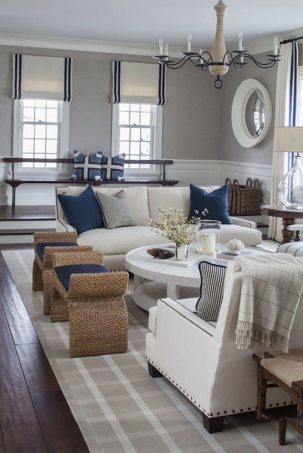
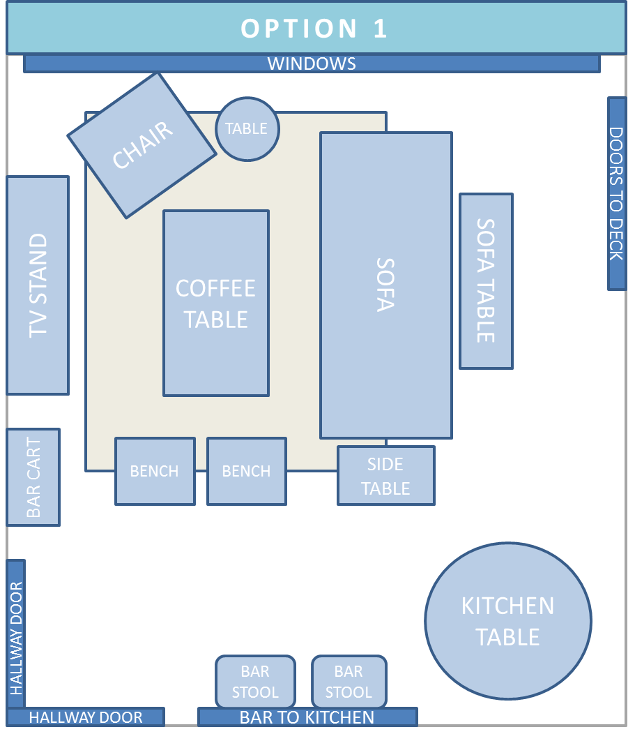
LIVING ROOM:

The next room is actually the first one that we decided to tackle – “the red room”.

It was staged here as the dining room, but we are using it as our living room.  It is the largest space in the house, measuring about 20 feet long by 16 feet wide, so it seemed like a huge waste to use it as a dining room.

IStkb73pa3a0870000000000

It’s also adjacent to the kitchen so from an entertaining standpoint, we like having all the social areas together, instead of having people split up at a party – half in the living room at the front of the house, and the other half mingling in the kitchen or outside at the back of the house.

We’re still working out what room will ultimately be the dining room, but this room will continue to be the main living room.

So anyway, back to our living room… I call it the red room, Kris refers to it as the Christmas room, and it’s pretty clear why.  These pictures do not paint the picture of how dark and drab and heavy this room felt.

ISt4zu4v9i9ox80000000000

Holy cow – there was so much red damask wallpaper in here, and it just felt SO DARK!

Had it just been the dark red, it would have been dark, but less offensive… it was the green accents that made me really dislike the whole thing.  The green trim ran around the picture frame railing, and the pillars were also green – a Victorian era Santa and Mrs. Claus would have loved this room.

I should also point out, the pillars are wood – they were just painted to look like green marble or malachite.

ISh3i7m8nryr770000000000

IS9xfv32jjqu770000000000

There were also the ruffled curtains, heavy tapestries, scalloped red (of course, more red) valances, with balloon shades.IS1rdjlvebix770000000000

And let’s not forget about the hunter green ceiling medallion.

IS9h3j58iypix80000000000

I can not stress how dark and sad it felt.  I know it doesn’t look it from some of these pictures, and after showing friends and family the photos before they saw it, we heard a lot of “it’s not bad!” or “I kind of like it”… but in real life, the response was more, “oh… yeah… it IS dark.”

Keep in mind that those photos were taken by professionals, who made sure that they were well lit and edited so that the real estate listing would shine.

Here’s how it actually looked and felt before we moved in…

IMG_2880IMG_2913

IMG_2909

IMG_2910IMG_2914IMG_2915IMG_2916IMG_2918IMG_2919

I snapped all of those photos in the middle of the day, with the shades up, and the lights on.

The problem here was the dark colors – the dark wallpaper just swallowed all the light up, When I am able to post a few photos of how the room looks and feels now, you will definitely be surprised at the difference. You would never know it from these photos, but the room actually gets really good light.

To also put this in perspective, in these photos, the trim looks like it’s an off white.

It is NOT off white.

It’s a dark, DARK tan – like darker-than-my-skin tan.  That hopefully illustrates how much lighter it feels now with crisp white trim… but I digress.  Let’s get back to the house tour.

THE KITCHEN:

Before we even saw the house, I was shown a single photo of the kitchen, and I was smitten. The kitchen has a few cosmetic updates we’d like to do down the road, but overall, it’s pretty incredible…

IS5257k5yel8870000000000

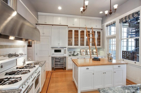
The floor to ceiling cabinets… the entire wall of windows… the french doors out to the deck…ISlywimo5a1rx80000000000

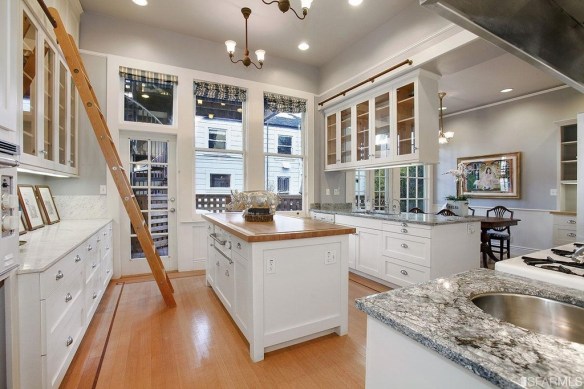
The LADDER!!  I mean we have a ladder in our kitchen.ISp9o6lyod42y80000000000

Those things aside, here’s a quick list of updates we’d like to get to… after the bathrooms… after the wallpaper stripping… after the trim is painted…

Updates to the countertops, upgrades to some appliances, updates to several fixtures and lighting, fixing chips and nicks in the cabinets, updates to the window treatments, and updates to the cabinet interiors.

Don’t think that I am complaining though.  Quite the opposite.  This is the Taj Mahal compared to the kitchens I’ve lived in my entire adult life.  Just even having counter-space is such a luxury coming from apartment living.ISle9vki6v13870000000000ISxfqi35tlczx80000000000ISxv2v1zt6db870000000000
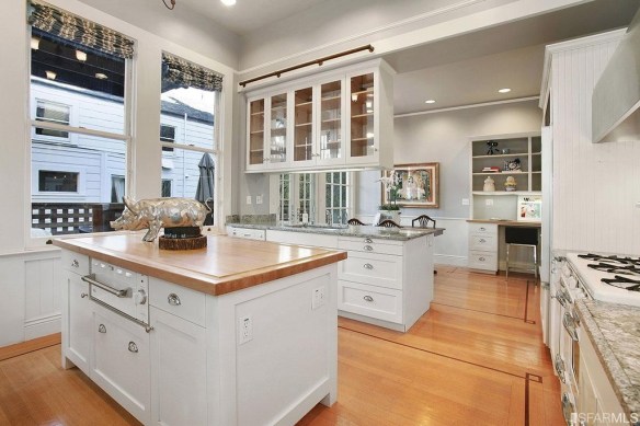
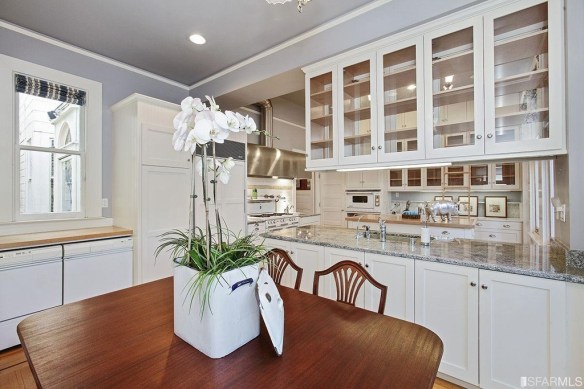
And in the kitchen you’ll also notice a breakfast nook… nook is the wrong word.  Breakfast room?  When it was staged, it held a good sized dining room table, certainly large enough to seat six.

This is where we currently have Kris’ office set up which has worked out well so far, but I still toy with the idea of making it into our dining room, and using that front room (where our dining table currently is) into a office guest room combo.

Eh, plenty of time to mull that idea over.

Last but not least…

THE DECK:

ISledi1249zfy80000000000IS9dwuifhioj870000000000
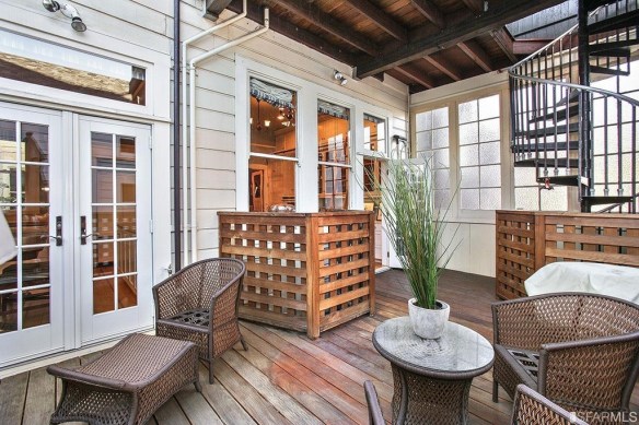
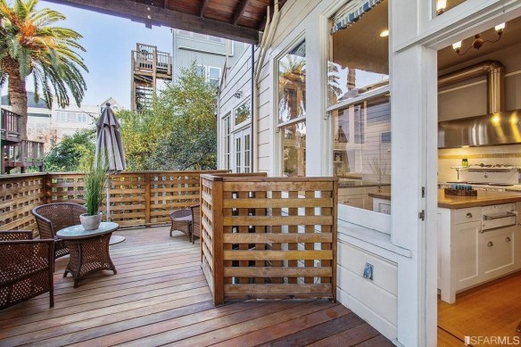
Currently, we have a mish mash of deck furniture out here, along with my tools, and a few boxes.  It is not the cute urban escape I envision, but it WILL be.  That’s the thing.  Eventually, this will be our little oasis, and it starts with a BBQ.

Once that BBQ is here, I’m certain I’ll want to get the rest of it whipped into shape… a pretty outdoor sofa or sectional, some new plants, umbrella, and eventually, maybe even a heat lamp for lingering late into the evening.

So, there you have it!

The full tour of our house, as it was before we moved in.  As you can see, there are areas that will need more work than others, but my wheels are turning, and we’ve already made some significant headway in a few spaces!

Can’t wait to share as we move along!!

Refinishing our Hardwood Floors

So here’s the good the bad and the ugly about our experience refinishing our floors.  Really just the good, but I wanted to post about what we learned, and what we did, since there was not a lot of information out there when I was in the research phase.

Specifically, about choosing a stain!!

IMG_2705

I WISH this post had existed several months ago, when my husband and I were agonizing over deciding on what color to stain our floors.  And I do mean, AGONIZING.  Who knew there were so many stain colors, combinations, and methods of application… not to mention, once you throw in what kind of wood floors you’re working with, there is yet another variable in the equation of figuring out how your floors will actually turn out.

Let’s start at the beginning though, shall we?  Rewinding the clock back to December – Kris and I bought our house in December, and the sale closed right before Christmas. I knew, even before it was officially ours, that the first thing I wanted to do was refinish the floors.

This is a beautiful, old Victorian, and when I say it’s “old”, I mean OLD.  It was built in the 1890’s, and it still has the original hardwood floors.  When I found that out, I was SO excited – it is SUCH a pot of gold, but they had seen better days.

Ok that’s an understatement…

They were scratched to hell from years of abuse, and the nail pattern was VERY obvious on the light wood.  Also, the nail holes looked like big dark spots as the nails had rusted at some point.  There were also stains from water damage, and animal urine (which, I should note, the entire house smelled of).  The areas where the furniture had sat were much darker due to sun damage on the surrounding areas. And finally, there were a few very poorly done patch jobs in recent years.

Take a look for yourself:

IMG_2330

Look at all the scratches, discoloration, and the very noticeable rows of nails… also in the picture below you can really see how the sun bleached certain areas.IMG_2343

And here is one of the former pet’s favorite spot to go potty… so special…IMG_2367IMG_2368

The shoddy patchwork was invisible to me at first, but as soon as it was pointed out, it was all I could stare at… not only did they use a different type of wood, but they used short little nubby slats laid down next to slats that ran the entire length of the room.  I mean, it’s only a few dollars more to replace it with a longer slat!!  I mean, it literally would have been a difference of $50 to do it right the first time!!  UGH!!IMG_2369

BUT, even with the damage, these floors were giving me heart eyes – they were original to the house, and made of gorgeous white oak, which is hard to come by these days. Nothing a little sanding, staining, and minor re-patching couldn’t solve.

We decided that before we moved in, we’d have the wood floors refinished, to save us the headache of trying to do it down the road after we were moved in, and I am still SO HAPPY we made that decision.

Just look at what a difference a single pass with the sander makes:

IMG_2374IMG_2373IMG_2372

We worked with some local flooring contractors who were ROCKSTARS!!  Side note: If anyone in the bay area is looking to have their floors re-done, email me, and I’ll send you their information.

Anyway, as they got to sanding, we needed to choose a stain for the floor.  I kind of loved the light white look of the sanded wood, but with the nail holes, we knew we needed something darker to help camouflage them.

Our flooring guy also advised us away from anything too dark because it shows dirt so much faster than lighter colors.

As we looked online for hardwood floor inspiration, I had an aversion to anything too “red”, Kris didn’t want anything too “yellow”, and we agreed that it couldn’t be too grey and weathered because our house was traditional… and a beachy / rustic floor would not mesh well with the traditional, intricate moldings, and Victorian details running throughout.

We decided on a mid-tone brown – nothing too red, yellow, or grey… and nothing too dark or too light.  I felt like Goldilocks trying to convey what we were looking for to our contractor.  He probably thought we were nuts.

After articulating what we were hoping to achieve,  we went back online to find floors we liked, that listed what stain color they used. Unfortunately, it was not easy to find.  We kept finding:

  • Floors that we liked, but that didn’t list what stain they used
  • Floors that we liked, where the wood was a completely different type than ours (so it wouldn’t turn out the same on ours)
  • Floors where the wood was also white oak, but the stain was not the same look that we were hoping for

We showed our contractor a bunch of pictures for reference, and since we didn’t have an exact example with stain colors we could replicate, (and seeing that I had a very “particular vision”), he decided it would be best if he laid down stain samples for us to look at in real life.

Which leads us here:

IMG_2705

Yeahhhhhh…… almost 20 samples later, we were completely unsure which to choose.

To be fair, we started with about 5 squares… but none of them were quite right.  So we sampled a few more, then a few more, then a few more.  It’s like that book, “If You Give a Mouse a Cookie.” #amiright

Anyway, I may have needed 20 samples to make a decision, but I’m hoping that these pictures help someone else who is re-doing their floor because this information is hard to come by!!

IMG_2493

If you like any of these, here’s what they each are:

Right row, bottom to top: 

  • Minwax: Provincal
  • Minwax: Jacobean
  • 1 part Minwax Jacobean, 2 parts Minwax whitewash
  • 1 part Minwax Jacobean, 1 part Minwax whitewash


Middle row, bottom to top: 

  • 1 part Minwax Dark Walnut, 1 Part Polyurethane
  • Minwax Dark Walnut (applied to dry wood floor)
  • Minwax Dark Walnut (applied to wet wood floor)
  • Minwax Eary American (applied to dry wood floor)
  • Minwax Eary American (applied to wet wood floor)


Left row, bottom to top: 

  • 2 part Minwax Dark Walnut, 1 Part Polyurethane
  • 1 part Minwax Jacobean, 1 part Minwax whitewash (applied to wet wood floor)
  • Minwax: Provincal (applied to wet wood floor)
  • Minwax Fruitwood (applied to dry wood floor)


Also, for hardwood flooring novices who are like, with water??  Polyurethane??  White wash??? What do those do?? Here’s a brief education:

Treating the raw wood with water before staining opens up the grain – the result is that the wood soaks up more stain, and ends up being darker, with a more pronounced grain.  Using the same mixture on non-water treated wood is lighter, more stain wipes off than gets absorbed, and the grain is more subtle.

We really preferred how our floors looked when the stain was applied without water-treating due to the variance in wood grains – the water treatment made our floors too dark and too busy, so we liked how the stain looked when applied to dry wood.

In a few of these samples, we mixed polyurethane with the stain to lighten the color – it was like diluting the stain without changing the tone.

Adding white wash stain to the colors made them appear more grey – not a look we liked for our house, but would be really great in the right home.

In the end, we ended up choosing 1 part Minwax Dark Walnut, 1 Part Polyurethane – middle row, bottom sample in the above – and they turned out AMAZING!!  It’s really hard to capture the true color of the finished floor in photos, and I have more (better) photos to share, but for now here’s a few:

How amazing is this mahogany inlay in our kitchen?!?!  I am SO obsessed.  I snapped this at night with the lights on, so they look a lot more yellow and red than they do in real life…

IMG_2991

In these photos below, you kind of get a sneak peek of how our living room used to look (heavy dark red curtains, dark red damask wallpaper, beige trim, and hunter green trim). BUT, despite the really dark and awful wall paper, and low light, the floors are pretty true to color – a rich, true brown – not too dark, and not too light.IMG_2913IMG_2909

The picture below is a grainy iPhone pic, that I snapped just before the sun went down, but you can see that the floors aren’t TOO dark.  Just dark enough to really camouflage some of the really bad stains, and the nail holes.IMG_2884

And a blurry close of of that inlay trim… so SO pretty!IMG_2877

And finally, just a really close up photo of the stained wood, and nail holes… they pretty much disappear from afar, but are still noticeable up close.  It doesn’t bother me, and I think anyone who is buying an old home will also appreciate their history.

Despite sanding, there are still little nicks here and there (so if you are also sanding old floors, don’t expect them to look like they were just laid), but it’s part of our house’s story, and I really love how they turned out.IMG_2709

Since we finished the floors, we’ve moved in and this place already looks SO DIFFERENT.  Keep in mind, I took these pictures back in January, and it’s almost April!  In the last several months, we’ve made A LOT of progress stripping wallpaper, and painting.

More specifically, painting trim.  There is A CRAPLOAD of trim… which I love… it’s just very detailed, so it takes forever to paint, which I don’t love.  Some days it feels like I’ll be painting trim until I die, but I’ve made a lot of headway in recent weeks, and I can’t wait to share some before and after photos soon!!!

It’s really starting to come together, and I’m seeing parts of the house take shape, which makes me so excited for phase II… decorating 🙂

Hello…. It’s Me………

IMG_2458

Ha!  Couldn’t resist a little Adele reference!!

But really… I haven’t completely disappeared. Ok, I have, but for very good reasons!!

I had mentioned before that my hubby and I were in the process of looking for a house, and while it took several months, many weekends of endless open houses, multiple offers, and a few broken hearts, I am happy to be able to finally say…. WE BOUGHT A HOUSE!!!!

**queue confetti**

Now that we have closed, I feel good about making that announcement, and being able to finally talk about it here!  She’s (I’ve decided that the house is a “she”) a beautiful old Victorian with her own set of quirks, and I’m obsessed with her.

There is a post coming soon where I’ll take you through the particulars – what we love, what we hate, and what we hope to do to truly make her shine.  We’ve already started in on a few projects, and I cannot wait to share!!

xo


Inspiring Spaces: Black Framed Windows

Picture1

So… I have this board on Pinterest called “Inspiring Spaces”…  and it is a catch-all for beautiful rooms.  It mainly came about as a result of laziness, because I don’t have the discipline to file everything under super organized categories – I’ve tried to create a separate board for bedrooms, for bathrooms, for living spaces, for exteriors…. but what ends up happening nine times out of ten, is that I see something I like, and it gets added to this hodge-podge board… it is what it is folks!

BUT, while I may not have this board organized by room, style, color palette, or really anything else, what it lacks in organization, it makes up for in beauty.  It is FULL of pretty pictures, and it’s actually one of my favorite boards to just scroll through when I’m feeling uninspired.

Just a quick peek and you’ll see common threads if you look closely enough, so I thought, why not create a series for Simply Styled to corral some of the trends I’m obsessively pinning right now, and one of the things I’m really loving right now is the look of dark framed windows.  I have been completely enamored by this look for quite some time – it started with steel cased windows (which I wrote about in 2013), and has evolved into the larger category of all dark framed windows.

A few reasons I like this look:

  1. I love that it looks dramatic.  Glossy black trim instantly enhances the already beautiful trim that is on your windows.
  2. Windows with black trim lend a bit of “edge” into spaces verging on the feminine side, and they are an easy way to balance out other large, dark pieces of furniture in a space (big black armoire in an all white room? balance it out with dark windows across the way)
  3. It’s an easy and inexpensive way to get a similar look to my beloved steel cased windows (we can’t all be millionaires!!)
  4. It’s also a non-committal way to see if you’d like the look of steel cased windows in your home – before shelling out some serious cash for the real deal, you can test out a similar look for the cost of a can of paint, and a little bit of time… and worst case scenario… you hate them.  You can always paint them back.

But I mean, how gorgeous are they??

b559f1ecb09ddbe47a1502d4c3875e65

I just LOVE the drama of this kitchen – while the black cabinetry paired with the black windows might be a bit much for most spaces, imagine these beautiful windows in a different kitchen.  They give the oomph of a window dressing without needing to hang anything fussy in what should be a utilitarian space.

bd1db5da3ffcf530a9c85abafbdbdc4a

These black framed casement windows are EVERYTHING.  Oh if only this could be my kitchen, in the Scottish countryside…. with my herd of Cavalier King Charles Spaniels running around in their plaid capes….. and fresh scones being baked (and eaten) while gazing out these windows at the woods (this house actually is in the Scottish countryside – I strongly encourage you to click through from the image to the full article on Houzz.  Ahhhhmaaaazzzinnggggg!)

A short love note about casement windows – my entire family is pretty obsessed with them.  There’s this movie called A Child’s Christmas in Wales (which is really a movie made from the Dylan Thomas story) and we watch it every single year before Christmas.  At the very end of the movie, the little boy has just fallen asleep, and snow has just started to softly fall, and the boy’s grandfather opens up the MOST BEAUTIFUL leaded casement window that ever existed, to catch the falling snow in his hand.

Oh that window!!! You should watch that movie if only to see that fabulous window!

But I digress… black framed windows… that’s what we’re talking about here…

5d10725c5e599fc86a361a3782ed691a

0bef64d0627e6ebaf62892f7acf9b970

6e654f697963cd34b102f1b4b29b88c8

A lot of the spaces I love where black framed windows make a major impact are kitchens – specifically light kitchens (like these ones) that allow the dark windows to really pop… but I love them equally in all spaces…

I love them creating height and defining these living spaces (again, no curtains necessary)…

42f2f6970ebbd23eeb283f203f2399fa

0f544cb24d1cdbf088bc8a4b96135939

32f29638b30ec6a1e980196e8f7c43f8

And I love them on interior doors and windows too… like these pretty painted french doors that open into the study:

a39040b8a0b8e00a4ba7a48a833a51d8

And these ones that lead into the dining room…

68c0f6b60312f030445295ec34cc4910

This dining room below is clearly a very lovely space, with the floor to ceiling windows that have been painted black.  They really keep this room from being too light and whispy.  The reclaimed wood country table and chairs could go very “feminine” very quickly, but the dark windows with the industrial lighting keep it from being too soft.  I also like the way the bookshelf with the black metal frame plays off the windows, and gives a nice balance in the room.

270909788ff06542ff78f3f8858efe85

And this bedroom is another really good example of the black windows lending a harder edge to this otherwise very soft space.

561cf98bcd14adb7b49addd6ed63c514

And finally, this living room – really kind of a perfect example of how black windows can balance a space.  If they were painted with white in here, the fireplace would be kind of a big black hole in here, but the dark windows keep your eye from immediately going there by creating a sense of even distribution throughout the whole space.

78a69d52ed28913a37043e3e31daa89e

So what’s your take?  Do you love this look as much as I do?  Hate it?  Would you have the guts to give it a try?

Thoughts on Househunting

Picture2

Anyone that has moved will agree that it’s stressful.  Anyone who has moved while still looking for a new home will agree that it takes the concept of “stress” to an entirely new level.

And that is where we (my husband and I) are right now folks.  Limbo.  The big move-out is this weekend, and all our stuff will be going into storage while we continue to look for a home in San Francisco.  To say that this process has been an emotional roller coaster would be an understatement – several offers we’ve made on homes have been trumped by all-cash offers… BUT… we are hopeful.  Kind of.  At least we aren’t giving up yet, or lowering our standards for what could be.  So that’s good news.

As we spend our weekends house-hunting all over the city, I’m working on a new talent that I refer to as “seeing past the ugly”.  Looking past the old decrepit bits and weird smells, the cheap renovations and the bad staging, to imagine what could be.  Kris is struggling with this, and so today I wanted to talk about one case in particular.  An already-pretty-nice, could-be-REALLY-amazing flat.

Here she is from the front…

435865_13_6

Let me just say, I do not think this is “ugly” by any stretch of the imagination (we have seen SO MUCH WORSE).  But I think we can agree that there is not much curb appeal, the building looks kind of sterile, lacking personality, and I don’t think I’d describe this house to anyone as “charming”.  She’s freshly painted (and I like the color), but other than that, the rickety fence and handrail, and the small yard of dead shrubbery could be stand to be improved… so what would I do to improve it?

First, I’d add shutters – black shutters specifically – to the upper and lower windows.  Is there anything that is more charming than shutters my friends?? I think not.

The fence has also seen better days, so unless it really needs replacing, I’d just give it a paint job – I’d go glossy black there too.  I also think the stairs would look nice in a contrasting color to the color of the house, so I’d paint them a dark grey (they are already painted, and the light grey shows dirt, and just ultimately just blends into the house, so without replacing them, paint will do just fine, though how pretty would brick look??).

Let’s talk about the current “yard” – it’s really sad. Someone at some point tried to spruce it up with the rose bushes, but they are not bringing any color or charm to the front, and in the winter when they are bare, it will look extra depressing.  I would replace them with something green and low-maintenance like a row of boxwood’s.  Since space is limited, I’d want the green to trail up to look as lush as possible, so I might want to add some climbing vines like creeping fig, or maybe even ivy, to add more green and a “lush” feeling to the front.

Finally, I think some window boxes with low maintenance flowers like geraniums would really be the cherry on top for adding curb appeal, and make this feel like a home.

With all these changes I see it looking something like this:

Picture1

Better, right?  I think just these few little changes would really make a huge impact here, and elevate this place to a new level.

Next up?  I’m going to tackle the interior with a few ideas…

Starting Fresh

FullSizeRender (3)

What to write in the first blog post……. always a tough one.

Let’s start with why I’m here. This blog is a fresh start for me – you see, it’s not my first blog.  I started CupHalfFull several years ago on a whim, initially using it as somewhat of an online diary <<kids, don’t do this!!!>>

I naively thought, surely, no one will ever read this, as I set it up on Blogger (Google’s blogging platform). I also spent about two seconds coming up with a name for it.

The first time someone commented on a post, I was shocked. How did they find me?  And why are they reading my secret blog?? It was like that moment in Sex and the City where Carrie gets email…. Can they see me?!

Lesson learned… blogs are NOT private.

I immediately combed through all my entries, deleting everything that was remotely mortifying (which was a lot), and I was left with a handful of posts that all revolved around one thing… my obsession with trying to decorate the new apartment that me and my then-boyfriend, now-husband had just moved into. What I never expected when I started CupHalfFull, was to stumble upon one of my true passions in life.

Design. Decor. DIY. Making things pretty (which in hindsight is kind of a great name for a blog… Making Things Pretty.  Damn it.)

So why a new blog, and why now?

I started toying with the idea of starting a new blog after I saw how hard it was going to be for me to just move CupHalfFull from Blogger to WordPress. And the more I thought about it, the more I realize that switching platforms would give me the opportunity to do it right this time.  To put some thought into the name.  To get the look and feel right.

Also, the timing is right.  Up until this point, we’ve been living in apartments.  We hope <fingers crossed>, to own a home. Soon. Which, when it comes to interior design, is a total game changer.

Ultimately, I want to dedicate Simply Styled to my passion for styling a space. I believe that making a space functional and beautiful is fun, and it doesn’t have to be complicated or expensive.

So welcome!  I’m so excited for everything that comes with a fresh start!

xoxo

Decorating a Beige Living Room

Happy Friday, and happy 3rd of July!!  I am gearing up for a mellow weekend celebrating the 4th – BBQs, swimming, and fireworks of course – but before we get the long weekend started, I wanted to check in with you all!

As you know, my best friend just moved into a new apartment, and as she fills the new space with furniture, I’m here to help out and give advice where needed. I woke up this morning to a text from her saying that she doesn’t love the couch she ordered, and everything just looks really blah and monotone (beige sofa, beige rug, beige walls).

PERFECT timing, because I’d started this post earlier in the week.  Let’s talk about what do do when your room is all one color… beige.  I was going to title this “Decorating a Neutral Space”, but let’s call a spade a spade… everything in her apartment is beige, so it’s now “Decorating a Beige Living Room”.  This is a big problem a lot of people run into but it’s actually a really easy fix.  Sometimes it’s a case of the person being scared of color.  Sometimes it’s a case of them gravitating to the same color for everything they own.

Here’s the room as it stands right now:

The good news is, the room has good bones.  Not a bad “before”… am I right?!

The light in here is awesome… it gets really good exposure!  I mean, a full wall of windows, and adjacent sliding doors to the deck.  It doesn’t get much better! And, the sofa looks SOOO good – it’s the perfect size for this room.  So excited to get started.

Ok so, with good light, open layout, lots of windows, and fabulous core pieces to build out from, it’s just about adding some pizazz to all the beige (the walls, the rug, the sofa the console table).  So let’s talk about creating a calm, beautiful room based around neutrals, without it ending up being bland, beige, and boring.

Step One: start with a color palette
The key is to choose a color that you love.  Look at your wardrobe – what do you wear?  Do you look good in rosy colors?  Does green make your eyes pop?  Also what makes you happy – are you your best self near the ocean? In the woods?  I happen to love blue, so that’s the color I went with for this exercise, and based on Kira’s pinned spaces (take a look at some of those here) these rooms are a mix of preppy, beachy, and rustic, and I think blue lends itself well to that aesthetic.  Once you’ve decided what colors you’re into, then move onto step two…

Step Two: Decide where to bring in color
I’m a HUGE proponent of keeping the most expensive things you own neutral, so that you don’t tire of them as easily, and so you can change out the accessories when you get bored.  If you had a big green sofa, it sort of limits your color options.  But if we do colorful accessories (rug, pillows, curtains, throw blankets, art) on a neutral sofa, it’s easy, and quite a bit more cost-efficient to get new pillow covers than to replace the big ticket items).

Step Three: Bring in live plants
The emphasis here is on the word “live” – we are not talking silk flowers.  A room feels dead without anything in it that is “living”.  For a space like a living room, I’d recommend one larger green plant and one smaller plant (I like orchids – they stay alive for several months, saving you money on cut flowers every week, and they’re just so pretty, what’s not to love?!)  Trust me – a plant or two in a all beige space really brightens things up – even without changing anything else.

So with all that said, I put together four variations of the same room.

The things that stayed the same in each room:
     – The sofa (this is the exact sofa she bought)
     – The side table (which she already owns)
     – The art (similar to the gold leaf art she owns)
     – The wall color (a very pale grey).

Ok, let’s get to it….

Room One: Here, we brought in color through the navy curtains, navy stools, and patterned blue and white throw pillows.  The rest of the room is very neutral, with a natural fiber rug under the oatmeal colored sofa she bought. 
The key to pairing a neutral rug next to a neutral sofa… they need to be different shades (one warmer and one cooler perhaps), and different tones (one lighter and one darker), and very different textures to ensure one doesn’t visually run into the next.
Room Two: Here I kept the blue curtains, but swapped out the natural fiber rug for one with a bold pattern and color, and exchanged the navy stools for a ivory bench.  
If I had to guess, I’d guess this would be Kira’s least favorite of all the rooms, because there more color in it than there are neutral tones, but I thought it was still important to see it.

Room Three: This will be the hardest to get right in real life because it’s the most neutral of all four options.

I swapped the navy curtains for white, brought back the natural fiber rug, which means that the stools and pillows are the only source of color here.  In real life, I think I’d recommend moving the gold leaf art to another room, and bringing in art with more color because the risk is still there of ending up with a borderline drab room.

BUT, maybe not… I’d just have to see it as it came together……..

Room number four – this is really a combination of rooms two and three.  Here, I kept the white curtains, and brought back the blue rug.

I like this one, but something about it seems a bit off – like it’s bottom heavy. Having everything at eye level so neutral, and then the dark rug, I think the walls need something with substance as well. Maybe even having art in a black frame, or a really large wall mirror propped up against the wall behind the sofa with a big black frame.  Just something to anchor the upper half of the room a bit more.

So anyway, this is really just a jumping off point to get the ideas started.

Ultimately, I really like all these rooms for very different reasons.  I like number one the best because it feels really balanced, but I suspect Kira will want to go with lighter curtains, and with all the light that comes into her apartment, I wouldn’t want a dark curtain panel blocking any of that out.

Because of that, I think we need to think carefully about what colors to bring in, what patterns to incorporate, and how to ensure its not only balanced, but that she loves it.

Next up, I want to talk about hanging curtains in a tricky spot………..

Chicago Apartment: Coffee Tables

Adding onto yesterday’s post, I wanted to pull together some (affordable) coffee table options that fit within the living room aesthetic.  
Some are more rustic, some more refined.  Some have storage (hello hidden remote controls) while some offer no clutter concealment.  Some have glass tops, some are solid wood.  Some are more beachy, which some are more elegant.  They really run the gamut – hopefully there are some contenders in there for the Chicago apartment.
Which are your favorites?

Chicago Apartment: Living Room Inspiration

Now that we’ve got the layout sort of figured out, it’s time to start pulling together inspiration.  
These images came straight from Kira’s Pinterest board, and it’s pretty clear to see the common themes in what she likes:

Clean lines.

Traditional core pieces.

A little preppy.

A little nautical.

Light colors.

Gold accents.

Soft upholstered furniture.

Warm wood tones.

A few rustic pieces.

Based on things she has, and things she plans to buy along with her Pinterest pages, I pulled in a few benches, a coffee table, and a few table lamps that go with the look and feel of what she likes.

She already has the white console table, gold bar cart, and gold side table, (numbers 2, 4, and 7) and plans to buy this sofa from Pottery Barn (number 1).

What I like (and what I think she will like) about the other things I’ve pulled in (the coffee table, the lamps, and the benches), is that they are all within the neutral palate that she likes, and will serve as a canvas to bring in more color through additional accessories (pillows, curtains, art, table accessories, books, and perhaps the rug).

A few things to be very careful of based on the above pieces…

1. Too much gold.
Yes, there is such a thing.  With the gold side table, the gold bar cart, and a series of gold leaf abstract paintings she has, she already has quite a bit of gold going on.  The gold lamp will only work if she doesn’t do the gold ottoman, and if it’s placed on the console table at the far end away from the gold side table.  If she does the gold ottoman, it cannot be placed next to the gold side table, and the room will feel more balanced with the wooden table lamp on the console table behind the sofa.

2. Needs color
As I said, these pieces serve as a neutral canvas for color (and the ability to switch accessories out with the seasons for a different look and feel between warmer and cooler months).  If the curtains are neutral, the walls are neutral, the rug is neutral, and the pillows are neutral with all this neutral furniture already going on, this is going to look BORING.  At least two of the three (rug, curtains, pillows) need to have color and pattern going on to bring in interest – my recommendation would be either the rug and pillows, or the pillows and curtains, if she doesn’t want to do all three.

So this is the jumping off point… time to source a few more pieces to choose from (coffee table, lamps, and chair / bench options) and then the fun stuff… the accessories and color that will bring life to the living space.

Furnishing a Chicago Apartment: The Layout

Hello friends!  It’s been a while (does every post start like that now??)

I just got back from a weekend in Chicago, visiting my best friend, Kira.  She’s about to move from a super modern high-rise apartment on the river, to a really charming spot in Gold Coast.

Luckily, the new place has an amazing layout – tons of light (which is essential for those long, dark, Chicago winters), and it is in the most amazing neighborhood.  It’s all tree lined streets and darling brownstone walk-ups; a block from the lake, and it’s brimming with restaurants, shopping, bars, and coffee shops.
It’s amazing.  

The challenge is taking a completely empty apartment, and turning it into something really fabulous. This is where I have been enlisted to help.

This is her first apartment of her own, and while she already has some really good stuff (bedroom furniture, art, occasional furniture and accessories), she’s also going to need to invest in some major pieces to complete the main living spaces.  Since she moves in just a few short weeks, we want to get ahead of everything now, and put together a game plan.

The first thing I like to tackle is the layout.  Over the weekend, we brought a measuring tape to the apartment, to get a sense of what can fit, and where everything should go. Each room is BIG, and based on cable hook-ups, doors, windows, and electrical outlets, it’s set up for a good floor plan already.

Starting today with the living room, here’s the layout we’re working with:

The living room is open to the kitchen with a bar – perfect for barstools, and has an entire wall of windows letting in tons of natural light.

She needs this space to function as both living and dining areas so with the cable hook-up running along the left wall, the ideal layout looks something like this:

Since the living space is where she needs the most new furniture, we need to prioritize what she buys first.  Here’s what’s on the list of essentials and first priorities:
      – New sofa
      – Coffee table
      – TV
      – TV stand

Also on the list, but less essential or decorative are:
      – Dining table for hosting (and chairs)
      – Additional living room seating
      – Lighting (table and floor lamps)
      – Curtains
      – Possibly a rug

With this list of furniture, and a broad layout in place, I put together three layout options that could work for using this space as dual living and dining – good for hosting dinners, and get-togethers.

Option I: really good for entertaining – the benches are low to the ground, so they don’t block off the view of the living room as you walk in.  They are also really awesome for entertaining when you need extra seating, or if you wanted to tuck them away for more standing room, they could easily go underneath the sofa table behind the couch.

Option II has fewer seating options, but brings in a desk to this space as well.  Since Kira will be working from home several days a week, I thought it might be nice to have a dedicated work space that isn’t a) the couch b) her bed.  Having a desk makes for a more productive work day at home, and also helps you unplug – shut the laptop, put it in the desk drawer, and leave your work for the day at your desk when it’s time to watch bad reality TV.

In this scenario, I didn’t include a desk chair – I figure one of the kitchen table chairs can double as desk chair, and can be brought back over to the table if company is coming over.  The large side chair here could also be substituted with the dual stools.

Which brings me to Option III: the desk is gone, the additional seating is brought back, but the kitchen table has changed.  
I scooched everything in the room a bit closer to the windows to accommodate a slightly larger rectangular table. This can a) seat more people and b) double as a desk during the day while she works from home (whereas I find working at a circular table kind of annoying – there is not enough room on the sides of your laptop for note taking, or an extra mouse).
Each layout obviously has it’s pros and cons, but which do you like best?
Side note to all this: There are more posts coming on this apartment – tackling questions like how to hang curtains in a tricky space, and more exciting… a few inspiration boards that detail out what pieces to buy to fill this gorgeous space.